Styling Bullets
Posted May 28, 2013
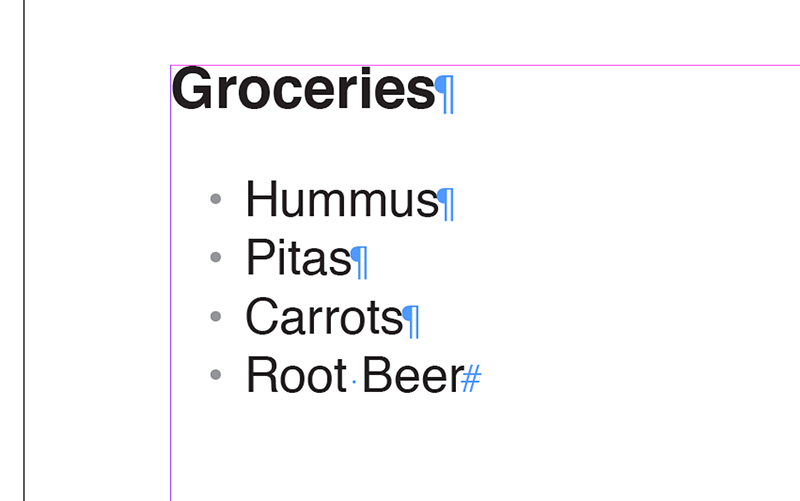
Taking the time to set up and style proper bulleted lists is a simple step to making your documents look more professional and finely-tuned. Luckily, it’s quick and easy to do.
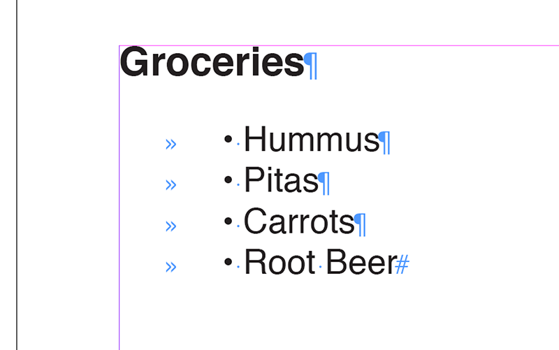
There are generally three ways to go about creating lists. Some people place bullets manually by inserting a bullet character (Alt-8 on a Mac) and a few tabs, but this is inefficient and makes it difficult to make global changes.
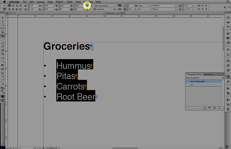
Another option is to use the bulleted list toolbar item. This enabled InDesign’s default styles (of which I’m not too fond), but you can tweak spacing and character settings through other palettes. This is alright for quick one-off lists and when you know where to look for all the proper settings, but isn’t ideal.
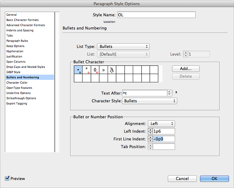
The right way create a bulleted list is directly with a paragraph style. Select your list, then created a new paragraph style – I generally name mine UL for bulleted lists or OL for numbers lists to follow the HTML equivalents.
Select Bullets and Numbering from the sidebar list, then adjust your settings. First choose your bullet character. For most purposes, the default bullet will suffice, but you can switch to any available glyph character loaded on your system to clicking the Add… button. This is an easy way to switch to square or arrow bullets, or to create a list of checkboxes.
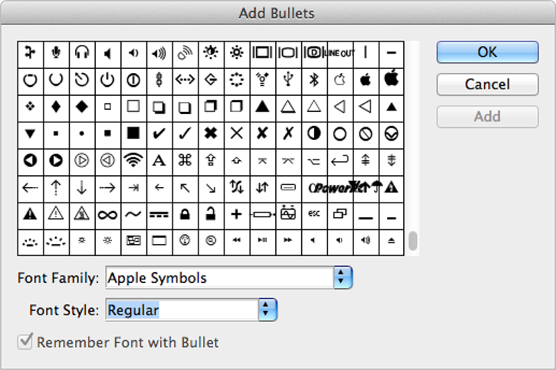
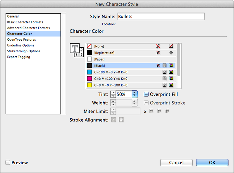
If necessary, you can also add character styling to your bullets. Use this to change size, color, or adjust vertical alignment of your chosen glyph.

Next, set your spacing. I typically start with setting my Left Indent to 1p6 (0.25”) and First Line Indent to -0p9 (-0.125”), then adjust spacing depending on the size of type, choice of bullet or other factors.
Now, your list should look great and you have a style that’s easy to apply to other lists in your document.
