Inspiration for the design of TEDxEvansville
Posted October 01, 2015
You’d think designing for a TEDx event would be fairly simple: Just stick to a red, white and black color palette and use Helvetica typeface. While those elements are certainly core to the design of any TEDx event, the TEDxEvansville communications committee, with help from the Evansville Design Group, a nonprofit organization comprised of local design professionals, faced these unique opportunities in the design process for TEDxEvansville.
- Make it unique. This is a universal challenge to anyone building upon a successful brand. How do you honor the original concept, while bringing something new and interesting into the fold?
- Build awareness. While people acquainted with TED have demonstrated universal excitement about the experience coming to Evansville, a large part of our community was unfamiliar with TED. We considered: What’s the best approach to introduce a concept that’s familiar to some, but completely unknown to many?
- Inspire through design. TED is centered around ideas worth spreading. We wanted our designs to excite the community and encourage enthusiasm around our community’s inspiring ideas.
Initial Brainstorming
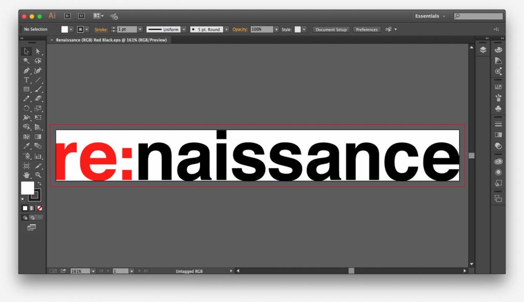
Evansville is undoubtedly in the midst of a renaissance, so that became a perfect theme for the first TEDxEvansville. In our initial brainstorming, we noted the principle words used alongside renaissance – rebirth, revival, and renewal – all begin with “re.” In fact, we found more than 100 words beginning with “re” that all represent positive sentiments. Another interesting idea is that “re:” is automatically prepended to the subject line of all email replies and is intrinsically attached to continuing a conversation in the most prevalent communication method used today. That was the genesis of “re:naissance.”
Focusing on Awareness
We discovered TED and TED Talks are not widely known in this area. So while expressing the theme of the event was certainly top-of-mind, our primary task became to promote “TEDxEvansville” as a concept without any other complications. That meant keeping our message simple and distilling the promotional materials down to the name, date, location and website. That also meant holding back on the “re:naissance” theme until closer to the event to minimize confusion.
Finding a Key Visual
With our beautiful venue, the Evansville Museum, in mind, we narrowed key visual selection down to two interesting shapes found in the Eykamp Pavilion – the golden rectangle and an elongated diamond. The former is used throughout the space on tile flooring, windows and exterior panels, and the latter has a repeating pattern wrapping the Koch Immersive Theater.
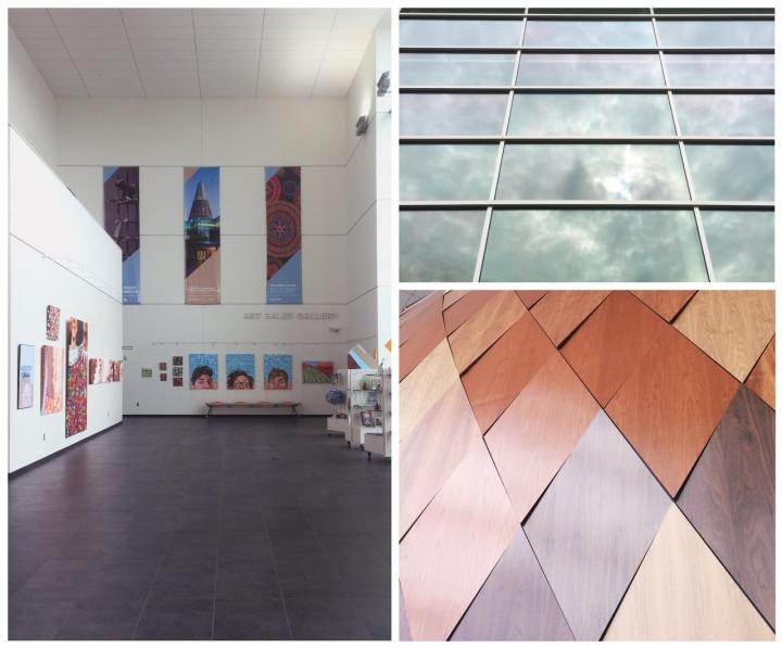
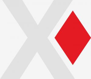
We quickly settled on the diamond shape for a couple reasons: 1) The Immersive Theater is host to the TEDxEvansville stage, and 2) A diamond is defined by the negative space around an “X,” a visual play too perfect to ignore.
Building a Design Language
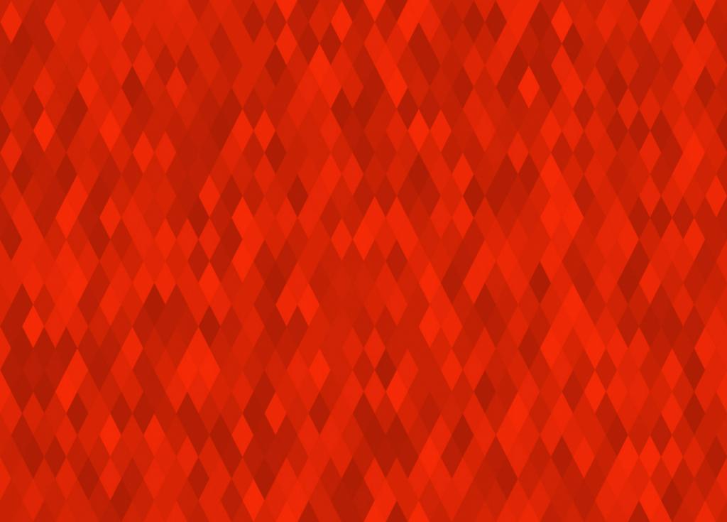
With the key visual determined, we began defining the building blocks of our design language. In addition to the standard base of red/black/white, Helvetica and the TEDxEvansville logo, we introduced a repeating diamond pattern mimicking the Immersive Theater’s pattern. The tiling of the diamonds serve as a perfect boundary to separate visual elements and introduce implied Xs into the design.
These components serve as the basis for all TEDxEvansville promotional materials. The “re:naissance” element is critical to event materials, such as tickets, signage, badges, shirts, posters, etc.
The Result
Now, the fun part – sharing what we’ve been working on and getting it into the community. The remaining pieces will be rolling out over the next couple weeks leading up to the event. In fact, several elements are public already, including the website, our social media accounts, tickets, billboards, a promotional poster and a promotional flier.
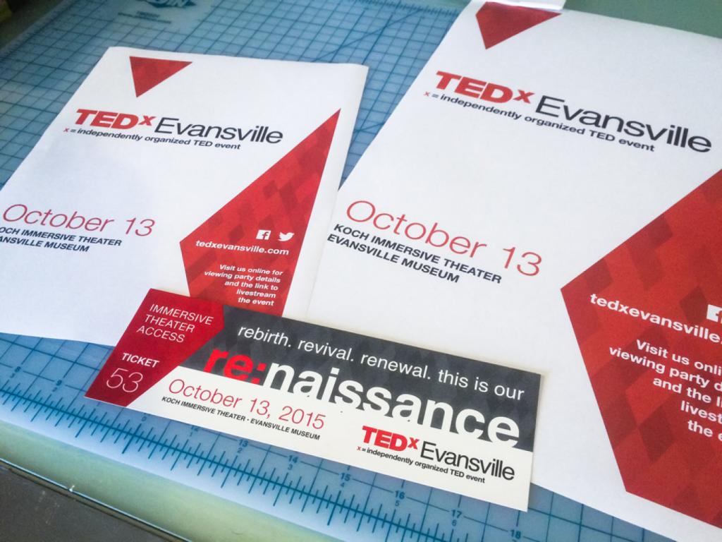
If you’d like to promote TEDxEvansville around your business, organization or other public spaces, please download, print and distribute copies of the poster and flier, which are available as PDF files below. The flier is standard 8.5“x11” letter size and the poster is sized to an 11“x17” tabloid sheet, both formatted with margins for any standard home or office printer.
- Download the TEDxEvansville Flyer
- Download the TEDxEvansville Poster
- View all TEDxEvansville Resources
All of us behind the scenes are incredibly excited about TEDxEvansville and we can’t wait to share and participate in this experience with our community.
This article was originally posted on the TEDxEvansville Blog: "Inspiration for the TEDxEvansville design."
